
Form
Summary
- Description
- Actions within Compositeur Digital UX
- Content extension
- Contents :
_questions.xml - Organize elements
- Input types
- Presenter types
- Form links
- Other Values
- Elements visibility
- Download a sample
Description
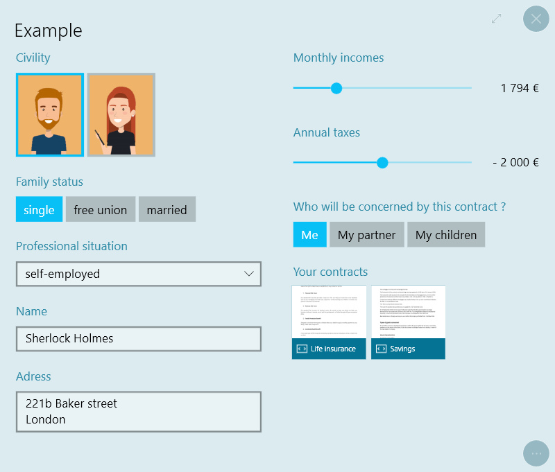
This type of content allows you to display interactive Form that will help you collect informations.
Actions within Compositeur Digital UX
Forms support the following action. To have a complete overview of each action, see the section Actions
Actions menu
| Annotate | Capture | Duplicate | Open in native app | Save as | Selection | Share |
|---|---|---|---|---|---|---|
| ✖ | ✖ | ✔ | ✖ | ✖ | ✔ | ✖ |
Interaction with the item
| Launch items | Questions |
|---|---|
| ✔ | ✔ |
Content extension
To create a form, put all the items you need in a folder, and add the extension .form at the end of the name of your folder.
Inside your folder, provide a file called _questions.xml
Contents : _questions.xml
A form is composed of small elements to present or collect informations :
<input>to collect informations<presenter>to display informations
They both can be described with the following attributes :
type: what the element will look like (see sections Input Types and Presenter Types)text: the title or question displayed above the elementtooltip: adds a question mark button next to the title to display the text given herevaluekey: store and retrieve the value of an input under this keyvisiblewhen: show the element only when the condition given is fulfilled (see section Elements Visibility)
Organize elements
Inputs and presenters can be written in the order of appearance inside the tag form or organised into columns thanks to the tag <section>
Examples Four inputs displayed in a single column :
<form>
    <input />
    <input />
    <input />
    <input />
</form>
Four elements displayed into two columns :
<form>
    <section>
        <input />
        <input />
    </section>
    <section>
        <input />
        <input />
    </section>
</form>
Input Types
Single choice

<input type="singlechoice" text="Family status">
    <choice text="single" />
    <choice text="free union" />
    <choice text="married" />
</input>
Add as much choice tag as you have answers inside the input.
The answers can also be images if you put images inside the form folder, using their names to fill the attribute image.
If both text and image attributes are filled, the text will be displated at the bottom of the image.

<input type="singlechoice" text="Civility" >
    <choice image="male.png" />
    <choice image="female.png" />
</input>
Multiple choice

<input type="multiplechoice" text="Who will be concerned by this contract ?">
    <choice text="Me" />
    <choice text="My partner" />
    <choice text="My children" />
</input>
Single line text
A free-text zone on a single line.
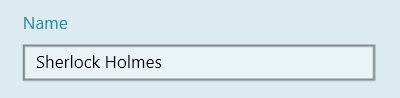
<input type="singlelinetext" text="Name" />
Multiple line text
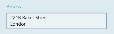
<input type="multiplelinetext" text="Adress" />
Slider

<input type="slider" text="Monthly incomes" minvalue="0" maxvalue="8000" format="# ##0 €" minlabel="no income" maxlabel="+ 8 000 €" />
minlabelandmaxlabelare non mandatory attributes but allows you to cusomize the displayed values.- For possible
formatvalues see standard format and custom format - the attribute
frequencysets the interval between two possible values
You can also specify all possible answers of the slider with choice tags :

<input type="slider" text="Annual taxes">
    <choice text="no taxes" />
    <choice text="- 2 000 €" />
    <choice text="+ 2 000 €" />
</input>
Number
For typing in a precise number.
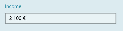
<input type="number" text="Income" format="# ##0 €" minvalue="0" maxvalue="10000" />
minvalueandmaxvalueare non mandatory attributes, the entered value will.- For possible
formatvalues see standard format and custom format - By default the input will prevent typeing non-numeric charcater. Add
allowText="true"to allow typing non-numeric characters if you prefer.
Combobox
To list a big quantity of answers in a reduced space, its recommanded to use a combobox instead of a singlechoice
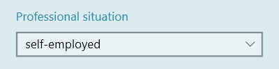
<input type="combobox" text="Professional situation">
    <choice text="employee" />
    <choice text="unemployed" />
    <choice text="self-employed" />
</input>
Presenter Types
Documents

<presenter type="documents" text="Your contracts">
    <entry text="Life insurance" source="contract 1.pdf" />
    <entry source="Savings.pdf" />
</presenter>
Form links
Form links add an actionable link to open a sub-form that must exist in the .form folder. Values entered in the sub-form can be displayed with formatted labels.
<formlink source="Options" clearValues="true">
    <label text="Name: {subformName1}" />
    <label text="{subformSurface:0 m²}" />
</formlink>
- Specify the name of the linked sub-form with
source(folder name without the.formextension) - Add a
labelentry for each line of information to display, occurences of{valueKey}will be replaced with the value if present, optionnaly add a format{valueKey:format}(see Number). - set
clearValues="true"to reset the label values when the form becomes hidden (withvisibleWhen)
Other values
A <choice> of type novalue adds a check box under the input to deselect all other answers.

<input type="slider" text="Monthly incomes" minvalue="0" maxvalue="8000" format="# ##0 €">
    <choice type="novalue" text="I don't want to answer" />
</input>
To allow the user to fill an other value than the ones you present, add a <choice> of type othervalue.
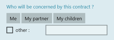
<input type="multiplechoice" text="Who will be concerned by this contract ?">
    <choice text="Me" />
    <choice text="My partner" />
    <choice text="My children" />
    <choice type="othervalue" text="other : " />
</input>
Elements visibility
You can choose to display an element X (input, presenter or section) based on the value of an input Y using the attribute visiblewhen.
Its value must have the pattern key comparator value(s).
The key is the valueKey attribute of the input Y
The different comparators allow to test :
- equality
= - difference
!= - numeric comparisons (
<,<=,>=,>) - unstrict containance
=*
Examples
If we have a multiple choice input with the possible answers A, B and C, we can have the following visbility behaviors on an other element :
visiblewhen="myKey=A": visible if the answerAis the only one selectedvisiblewhen="myKey!=A": visible ifB,Cor both are selectedvisiblewhen="myKey=*A": visible if at leastAis selected (BandCcan also be selected)visiblewhen="myKey=B&C": visible ifBandCare selected andAis notvisiblewhen="myKey=B|C": visible ifB,Cor both are selected andAis not
complete visibility xml example :
<input type="multiplechoice" text="Who do you want to protect ?" valuekey="protectionTargets">
    <choice text="Me" />
    <choice text="My partner" />
    <choice text="My children" />
</input>

<presenter type="documents" text="Suggested contracts" visiblewhen="protectionTargets=*My children">
    <entry source="School insurance.pdf" />
</presenter>
You can also add an attribute value to each choice and refer to this value inside the visiblewhen attribute :
<input type="multiplechoice" text="Who do you want to protect ?" valuekey="protectionTargets">
    <choice text="Me" value="me" />
    <choice text="My partner" value="partner" />
    <choice text="My children" value="children" />
</input>

<presenter type="documents" text="Suggested contracts" visiblewhen="protectionTargets=*children">
    <entry source="contract 1.pdf" />
</presenter>
Download a sample
A Demo Universe which contains a form is available, give it a try! 😄
Next : Report